Palgonsan Provincial Park autumn foliage painting

my painting of Palgonsan Provincial Park fall foliage

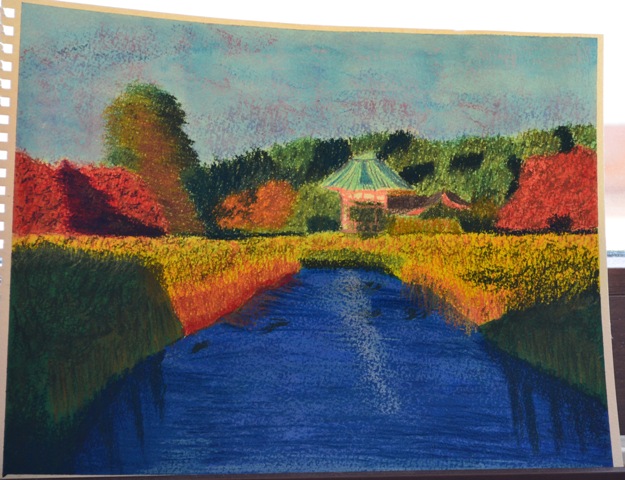
Thus continuing my love of brightly colored landscapes and a desire to make brightly colored paintings. This painting was accomplished with a watercolor underpainting, watercolor pencils for the trees, and hard pastels for the foliage texture. I chose this particular picture to paint, because I really liked all the wild, natural colors.

my painting of Palgonsan colorful forest interim 1

I first applied masking fluid to all the trees to save the white. Then I laid down a multi-colored watercolor underpainting roughly corresponding to the colors of my desired endstate. I didn’t try to be very restrictive in the sense of coloring in exact lines, but rather a bit more free flowing and abstract.

my painting of Palgonsan colorful forest interim 2

After the underpainting dried, but before I applied the foliage texture with hard pastels, I used watercolor pencils for the trees. I pulled up all the masking fluid and laid in the trees with a variety of colors. I like watercolor pencils more than normal colored pencils, because I can layer all the colors and the detail like a normal colored pencil, but then I can make a rich, controlled wash with the watercolor. Then I finished up the painting by applying layers of differing colors of hard pastel to recreate the image of foliage.

Palgonsan Provincial Park red orange and yellow leaves

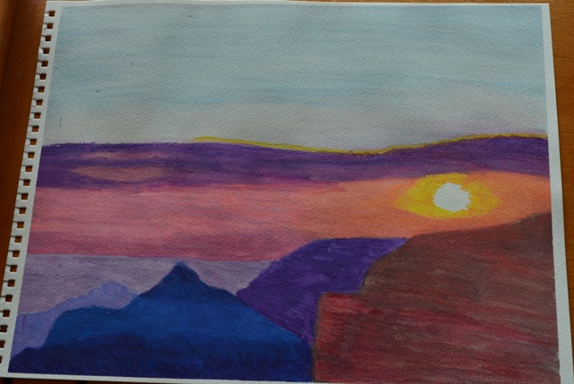
This was my reference photo. It was taken during a nice day hiking in Palgonsan Provincial Park one Saturday afternoon in October. I was completely taken by all the natural colors. Palgonsan Provincial Park was very easy to reach. I just took one of the numerous KTX trains from Seoul Station down to Dongdaegu, which was only about two and a half hours away by express train. The local bus number 1 out to Palgonsan Park and then just hike to your heart’s content and enjoy the beautiful Donghwa Temple and the beautiful nature. It made for an easy and pleasant full day trip.

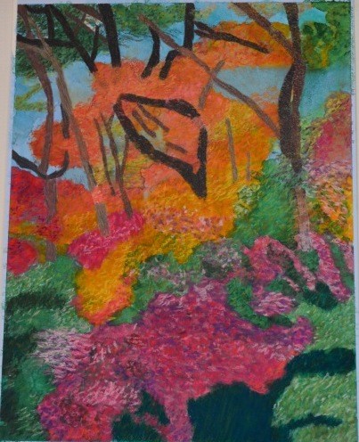
My painting is certainly not photo realistic, and part of me wishes that it was. But another part of me likes the more impressionistic nature of the painting and thinks it captured the abstract colorful nature of that autumn foliage.  I still need to work on representing light sources accurately. I’ve been trying to branch out my technique and move away from attempting to recreate the reference photo as much as possible, to a more abstract capture of the scene.

Iceland Thingvellir River and Church Painting

my painting of Thingvellir river and church

I spent two weeks in Iceland in March 2011. I made the conscious decision to visit Iceland in the winter, because I wanted to see the Icelandic winter landscape, and especially wanted to see the Northern Lights.

Thingvellir is a day trip from Reykjavik and is the site where the Icelandic parliament was founded around 930 CE. Thingvellir is the place of a beautiful rift valley and the largest natural lake in Iceland, Thingvallavtn. I went out to area twice during my visit. One of the visits was to snorkel and the other time just a bus trip as part of the Golden Circle day trip.

There is a lot I like about this painting and a few things that give me pause. I laid down a watercolor underpainting and overlaid hard pastels and watercolor pencil on top for the detail. I especially like the depth created on the ice formations with the blue pastel water, overlaid with indigo blue watercolor pencil to give depth to the scene. After some thought, I decided to create the shadows in the snow with a lavender watercolor underpainting and light blue and violet hard pastel for texture and shadow. The ice formations was created with blue, gray and white watercolor pencil and burnished to give the appearance of a smooth ice surface finish.

The parts of the painting that I felt I could improve the most is the background and distance. I could improve the water reflections in the distance. I also realized after the fact that I drew the church way out of perspective. The church looks way bigger in the painting than it was in reality. I feel I need to improve creating a background with depth and texture to make it look more realistic.

This was one of those paintings that I wasn’t sure about when I first decided that I couldn’t make it better, but it did grow on me over time.

Thingvellir river and church

Above is the reference photo I used for this painting. I really loved Thingvellir, though truthfully I loved all of Iceland. It was a remarkably beautiful country. This day was very cold, sunny and bright and it just accentuated the fabulous natural of this special country.

Tokyo Ueno Park Colorful Autumn Foliage painting

Ueno Park autumn foliage painting


This painting was the next in line for my autumn creations. I am deeply inspired by colorful nature, so for the most part, when I take pictures, I try and compose the pictures like I would a painting, because I know that I will probably want to paint it later. I selected this picture (see below), because it had the colorful foliage I like to paint, and it was a different setup than the previous painting from Bukhansan National Park. The composition for this painting reminded me of all the perspective drawings I did in art class as a kid. The majority of the medium for this painting was a watercolor underpainting  overlaid with hard pastels. The gazebo was drawn in watercolor pencil.

The most challenging part of this painting for me was to produce a sense of depth in the water to add to the perspective, and also to render the green foliage in the foreground with as much realism as possible. That required me to lay in multiple layers of pastel in different colors. Even then it still wasn’t completely realistic, but close enough.

Like most paintings, this one looks better from afar, and after I completed it, it took a bit to grow on me. Sometimes it takes a bit for me to finally say the painting is as complete as it is going to be. Frequently I am dissatisfied during the actual process of creating the painting, and I often feel that I am not producing the painting on the page that is in my head (and close to the reference photo). However, I eventually reach a point where I can’t think of any way to improve the painting and I call it done. Then, it takes a couple days for me to really develop an attachment to the the painting  and to like it.

Ueno Park colorful fall foliage


The reference photo was taken in Ueno Park in central Tokyo when I visited there Veteran’s Day weekend November 2012.  Ueno Park is one of Tokyo’s largest parks and right next to a major Metro stop  (Ueno). It’s a pleasant park to walk around and enjoy different museums, temples, shrines and gardens. This particular picture was taken late in the day and the sun was close to setting. I like the warm, late afternoon autumn light and how it makes most of the backdrop warm, though the cool blues of the water and green foliage in the foreground makes a nice contrast to the yellows and oranges in the background.

Bukhansan National Park Red Autumn painting

my painting of Bukhansan National park sunny red trees


Autumn in Korea is my favorite time in the country. The weather is cooler and less humid, which makes hiking so much more pleasant than during parts of the Korean summer when the humidity makes you feel like you just took a shower after stepping outside, and sometimes the monsoon rains gives you a real shower. But most of all, the reason I love Korean autumns is that the landscape come alive with bright, beautiful colors. Korea is a very mountainous country and there are numerous forests populated with trees that change color and foliage for the seasons. These bright colors of nature inspire me to create art.

The art my eye is drawn to, either as a viewer of art or as a creator of art, is bright and colorful paintings. I’ve never been a fan of dark, dreary realist paintings and preferred paintings that pop with color. Likewise the art I want to make is the colorful world around me. This makes autumns the perfect time to capture images to create paintings later.

The mediums I used for this painting were a watercolor under painting in greens and browns, watercolor pencil for the trees, and hard pastels for the foliage. I felt the combination of  mediums would be ideal to achieve the effects I wanted. This was the first time I used an under painting, and I was really pleased with the result for the most part, though next time I should fade out the colors of the under painting more to make the colorful leaves pop to a greater degree. In the past, one of the frustrating things about using white paper for paintings is that the teeth of the paper showed through  and marred the overall effect I was trying to achieve. Putting down the green/brown under painting enabled me to build the trees and leaves on top of the under painting and thus achieve a greater illusion of depth. The viewer can see the green poking through in parts of the painting to look like real nature. The big lesson I did learn for improvement with this painting, is that I should use an under painting for the leaves as well. This became readily apparent when I started to apply the pastels for the leaves. I prefer hard pastels, because I personally find soft pastels to be rather messy. Even though the pastels are hard, they have varying degrees of hardness and softness. The whites, yellows, and even the oranges to a certain degree were reasonably soft and therefore easy to build up layers of color to produce realistic-looking leaves. I ran into trouble with the red pastels though. That color was substantially harder and it was more difficult to apply the red color to the existing under painting. The reds didn’t pop the way I wanted them to, unlike the yellows and oranges, because they didn’t layer well. It was also more apparent for parts of the painting where the leaves overlaid branches. I initially used masking fluid to block out the tree branches before applying the under painting, so when the fluid was removed, the paper was white. Due to the hardness of the pastels, it didn’t build up layers of color easily and the whiteness of the paper can be seen behind parts of the painting. Overall though, I was rather pleased with this effort, since it was the first one like it that I painted. I think I mirrored the reference photo well enough (though it wasn’t a complete duplication), and captured the brilliant reds, oranges and yellows of this landscape.

Bukhansan National Park sunny red trees


This is the reference photo used for the painting. It was taken in Bukhansan National Park on a fine sunny October afternoon. The park is located within the Greater Seoul Metropolitan Area, which makes it readily accessible for urban hikers. Visitors can easily reach the park by taking subway Line 3 to Gupabal station, exit 1 and then Bus 704 or 34 to Bukhansan National Park. Just follow the hordes of people in hiking gear to the trailhead and follow the signs for the trails from there. The park’s location within Seoul means that this park is convenient not just to you, but to everyone (approximately 25 million people) in the Greater Seoul Metropolitan Area. While beautiful, particularly during autumn, this is not a place for solitary hiking, so know before you go. Crowds are numerous on the weekends, though if you want to beat them as much as possible, start very early. Yes, there will be early hikers, but they are the serious hikers and not the slow family walkers. You can walk as much as you want and turn around at any point, since the trail is well marked with signs and distances. The trail can be a bit uneven and steep in places, but for the most part, the trail is suitable to regular hikers. One word of advice though. Since this park is reached via a bus and not a direct subway stop, there is a high potential for running into long lines at the main bus stop for the park. When I went, I made it to the bus stop not long after sunset, and it took me an hour to get on a bus to go to back to the subway. The smart hikers in the know walked further up the road to catch an earlier bus stop and avoid the main bus stop with the very long lines. After all, once a bus was full of people from the early stops, it would just drive by the main stop. If you like hiking and love beautiful nature (particularly in autumn), Bukhansan National Park has much to offer for hikers, nature enthusiasts and landscape artists to be inspired.

The Artist’s Way- Week One

I’ve been wanting to expand upon my artistic creativity for a while. So I decided to purchase the book, “The Artist’s Way: A Spiritual Path to Higher Creativity.” The book has a 12 week program, and each week focuses on  a different aspect of your creativity. The book is targeted toward so-called “blocked artists”, where individuals want to be artistic and creative, but are blocked from pursuing their dreams due to some internal or external issues. Each work is supposed to be exercises targeting those blocks.

One exercise is morning pages. Each morning, the first thing you are supposed to is write down three pages of longhand. There are no guidelines on what you are supposed to write. It’s just supposed to be a sort of stream of consciousness of whatever comes to mind. There is no right way to do these, but the point of these writings are to get to these blocks, the ideas in your head that are holding you back from being artistic. In theory, these blocks emerge during the course of your writing, and you are supposed to counter those blocks with positive affirmations. These pages are also supposed to be a tool to unlock the creative parts of your brain.

The second aspect of the weekly exercises is artist dates. Again, there are no guidelines on what you want to do. It’s supposed to be a time for you to do whatever it is you want to do that inspires your creativity. It might be a long walk. It might be a visit to an art supply store. Maybe you go and create your own art. It’s supposed to be your time to just do something to inspire your artistic self.

The first week was focused on creating a sense of safety. The focus was supposed to be on bringing to light those negative viewpoints that are holding you back. It might be persons in your life that aren’t supportive of you pursuing your artistic dreams. Maybe people don’t believe in you. Maybe you don’t believe in you. The point was to list all of those blocks and affirmations to overcome them.

Overall, I found this week to not be overly taxing from an emotional standpoint. I personally don’t have unsupportive individuals in my life. My parents both believe I can do whatever I want, and I don’t have anybody else who has a negative opinion of my artistic ideas. My artistic block can be summed in one idea: I don’t know if I am good enough to make a living from art. My art IS getting better, though I could benefit from actual professional instruction. But who the hell knows if it is good enough to actually make any decent money from it? That’s why I’ve always viewed any potential art career as something more to do as a side project or something when I retire from my main career (assuming I make it that far in my career). Could I just go for an art career and give up my main career? My big block in that regard is I am not willing to be a starving artist. I don’t want to be poor, and I live in fear of being poor. Now granted, if I KNEW I would successful, I’d go for it, and work through any obstacles. But life and career don’t work that way. There are no guarantees in anything. I could be successful one day, or I could very easily not be. Am I willing to take the risk with no guarantee of reward? Right now, the answer is no.  So I’ve made a conscious decision to pursue a career field that pays pretty well, and the benefits are pretty good. Now let’s just see how long that can last. Until then, I can just continue to improve my artistic talent, so if I ever decide to pursue an artistic career, at least I’ll be ready for it.

Grand Canyon North Cape Royal Sunset Painting

my painting of Grand Canyon Cape Royal sunset

I’ve been trying to get back into painting again. I’ve created art in fits and starts for most of my life. Like most kids, I enjoyed drawing and painting in art class just for fun. I dabbled a bit with watercolors in college, before getting frustrated with not making enough progress, and stopping. Then for a couple years, I discovered the beauty and portability of colored pencils. Colored pencils give me the control I like, but the artwork can be time consuming. And again I wasn’t making the progress I hoped, so I gave it up.

About a year and a half ago, I decided to take it up again. This time, I decided to go with a mixture of watercolor pencils and pastels. I like the combination both bring to create artwork. Watercolor pencils give you the control and precision of wax colored pencils, but they also can be used for the color diffusion of watercolor paints. I like to draw the painting out and then follow up with water to blend the colors. Pastels are a great way to render diffuse, bold color, particularly for landscape paintings.

For this painting, I selected a reference photo of a sunset I took at Grand Canyon North at Cape Royal during my vacation there this past summer (see below). I felt it was a good picture to start with. I found it very beautiful, with bright colors- just like the paintings I want to create, and the paintings I appreciate as a collector. Plus, I felt it would be relatively easy to render, since sunsets seem to be easier.

What I will say about this painting is that- it’s not BAD for a first effort after months of not painting. It certainly could be worse. I’ve done better sunsets in the past, but something about this painting just didn’t work for me. Maybe it would have been better to render it in pastel, as watercolor sort of seemed to blend all the colors into one big patch, rather than the separate, distinct colorful clouds and sun from the reference photo. Or I should have been more disciplined in the drawing of the clouds. And the use of watercolor for the canyons just didn’t really come out like I hoped. The distant shadows were okay, but the closer canyons weren’t really distinct or detailed. Again, pastels might have been a better choice to render the shadows of the stones and the vegetation of the canyons.

When I first took the painting in after I decided I was finished, I was rather disappointed. I had this image in my head of how I would be able to correctly recreate the reference photo as a painting. While the painting captured the general use of color from the photo, the overall effect was flat. There was no dimensional shadowing or distinct clouds. There was no depth or real artistry.

But as what usually happens, the more time passed and the more I could take it in, I started to appreciate it more. Sure, it wasn’t what I envisioned in my head. But there is a colorful beauty there, and not all artwork must be 100% representational to be enjoyed. Think of it like a first draft of a writer’s novel. It may not be what I want it to be right now, but nobody starts out being a really good artist. It takes work, lots and lots of work to become a quality artist. Inevitably in that work journey, there will be efforts that don’t exactly thrill you, but still can teach you something, and you can still take away something from the creation to make future work better. I have to constantly fight against the internal voice that tells me if I am not instantly good at something, it isn’t worth working harder to become better at it. So while this painting is not what I hoped it would be, it’s representative of a first step toward becoming a better (maybe one day, professional) artist.

Below is the reference photo I took of the sunset. I visited Grand Canyon North in August 2011. This was my first night in the area, and I drove out to Cape Royal, because I knew the sunsets were supposed to be amazing. It was very peaceful to sit out at the viewpoint and watch the sun melt into a variety of blazing colors and paint itself across the canyons. It’s times like these on vacations when I am reminded again and again how much beauty there really is in this world, and it is this beauty that inspires me to be an artist.

Grand Canyon Cape Royal sunset